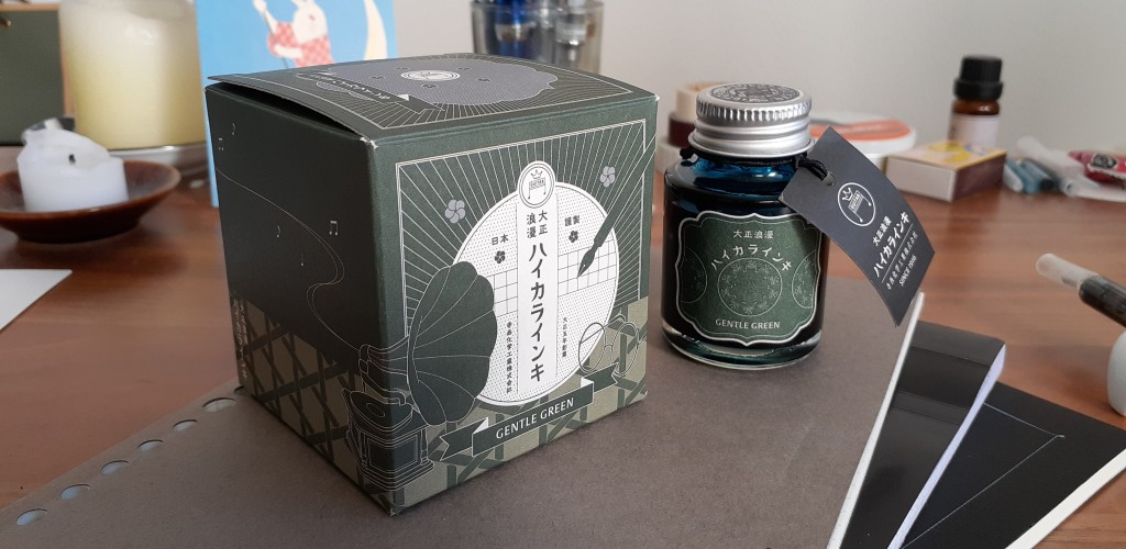
I had a lot of fun writing the first ink review yesterday, so I decided to move on immediately to the second one. This time, I’m looking at “Gentle Green” from Teranishi’s “Taisho Roman” line.
The naming of this ink line is a bit of a mess. First, you have the name of the company, Teranishi Chemical Industry. Then there’s “Guitar”, which I think is the overall brand name for their fountain pen and ink-related products (since they also make/carry a fountain pen named “Guitar”). After this comes “Taisho Roman Haikara Ink,” the name of the ink line, and then finally the name of the ink itself, “Gentle Green.” Wow. It’s really crazy if you untangle it like this. There are just too many words here. For the sake of this review, I’m just going to call it “Teranishi Gentle Green.”
“Taisho Roman” roughly translates to “Taisho Period Nostalgia/Romanticism.” The Taisho period lasted from 1912 to 1926 – it’s a rather short episode in Japanese history, but for many today, it carries the same kind of idealized nostalgia that many in the west feel towards the time of the Roaring 20s. It was a time when modern western culture started to truly permeate Japan. This is reflected in the ink line’s packaging – it shows phonographs, vintage-looking automobiles and phones, sailor uniforms, steam trains, etc. While using cheap materials, Teranishi managed to create a very theme-appropriate and nice-looking packaging for this ink like.
The first wave of these inks was released in the second half of 2021, and apparently they were a big success. As of January 2023, the ink line has expanded from the initial 4 to a total of 16 colors. I think that the packaging played a big role here. Teranishi is aiming for the same kind of audience that’s interested in Ferris Wheel Press inks – mostly young women that like to play around with ink and glass/dip pens (InkyRocks on YouTube calls them “Inkunuma Ladies”).
Judging by the rapid expansion of the ink line, it seems like Teranishi was successful with approaching their target audience. They managed to hit a sweet spot in the market, combining low-price but not cheap-looking packaging and evocative branding with a reasonable price. In Japan, you can get two bottles of Teranishi ink (40ml each) for the price of one FWP 38ml bottle – so it’s a perfect choice for Instagram-conscious newcomers to the hobby.
But now let’s talk about the actual ink! “Gentle Green” is one of the original 4 colors released in September 2021. It’s a blue-leaning green that reminds me of green velvet sofa cushion covers and patina-covered statues or iron fences. For the swatches and writing sample below, I used a simple Muji notepad. The ink looks roughly the same across different papers, maybe appearing a bit more dusty/paler on Tomoe River.
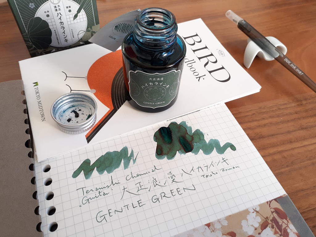
Similar to the ink that I reviewed last time, this is a color-changing ink. When freshly put down, the ink is a dark blue that eventually fades into the slightly undersaturated green that you can see above. For some, this might me nothing more than a neat gimmick, since you only see the blue color for a few seconds after writing. For me though, it may be one of my favourite fountain pen ink effects. It’s something you simply don’t get from ballpoint or gel pen ink, for example.

In larger swatches, Gentle Green shows some beautiful dark red/purple sheen in the areas where it pools. However, as you can tell from the writing sample, this effect doesn’t really show up in regular writing (it may be visible when the ink is used in larger/wider nibs). For the most part, your writing will carry the color of the tail end (right-hand side) of the swatches.

Conclusion
Teranishi Gentle Green is a nice, calming green with interesting color change properties. It’s a color that I mostly feel drawn to during wintertime, but it’s also dark and unobtrusive enough to be used regardless of the season for everyday writing in journals, notebooks etc.
Right now, I own two Teranishi inks, Gentle Green and Antique Black (which I might review next). Overall, I’ve been really happy with these inks. The packaging looks neat, but they don’t feel overpriced because of it (like FWP), the colors are interesting and there’s lots of options now. There are many colors that I could see ending up in my collection – Smoky Navy, Nostalgic Honey, Opera Rose, Brilliant Mint, or Traveling Sepia. You can see all inks and color previews of them on Teranishis homepage.
